

Improving time-to-hire in an ATS by 40%
Goodfit is an AI-native ATS and talent screening platform. It scores resumes, conducts AI interviews, and manages coding tests, creating a job pipeline for recruiters. A typical pipeline includes: Resume scoring, Assessments, AI Interviews, Human Interviews, Negotiations, and Offers.
On paper, all of this data existed in several places across the platform. However, juggling through several hundreds of candidates proved to be a bottleneck in recruiter performance.

Product
Goodfit
Goodfit is an AI-native ATS and talent-screening platform. It scores resumes, runs conversational AI interviews, and proctors coding and psychometric tests — funneling everything into a job pipeline where recruiters spend most of their day. Across 200+ companies, it’s already run over 300,000 AI interviews in 14 languages.
Details
Scope
UX Research, Interaction Design, Information Design
Surface
Web-based app
Team
2 senior designers (advisors) from parent company & 2 co-founders
Problem
The Profile Open Loop
Recruiters had to open and close 40–50 profiles a day just to make decisions. The info they needed existed, but none of it showed up on the board. Hiring took 21 days on average — which is too slow.
Solution
Decide From the Board
I put everything recruiters need right on each card: three clear scores, important signals, invite history and relevant experience. Using intentional hover on them, tooltips open to reveal details, and bulk actions help move fast.
Result
40% Faster Hiring
Hiring dropped from 21 days to about 12. Recruiters opened way fewer profiles, moved people in bulk with confidence, and stopped complaining about too many tabs.
Problem
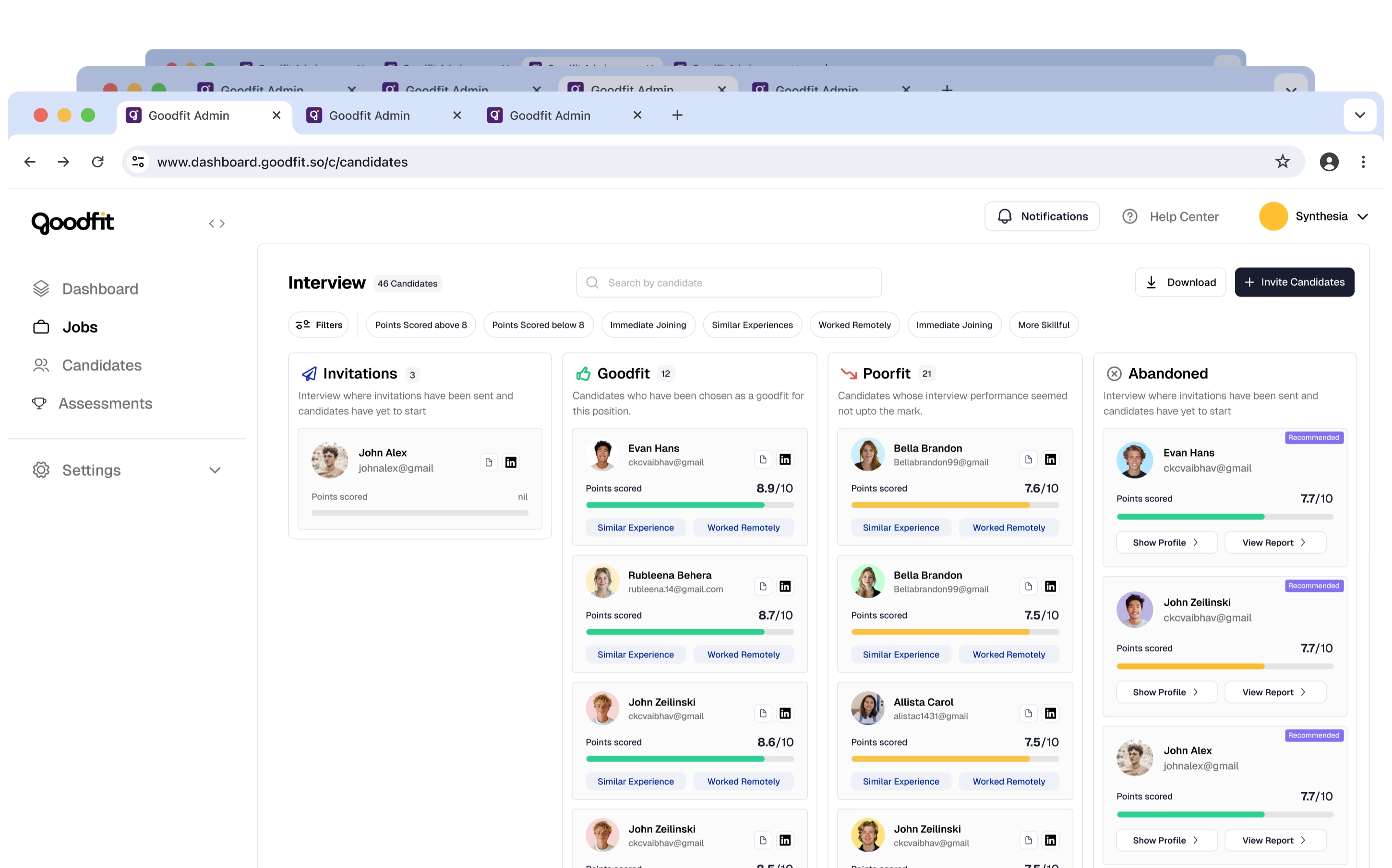
As an ATS platform, our primary users are recruiters. Through various calls and session recordings, we discovered that they often spend excessive time collecting information on candidates they wish to evaluate.

Key findings
Throughout this process, we were in constant touch with users to observe their behaviours. These were some of our key findings.




Workflow Scatter

The assessment results lived outside of the pipeline, which required users to switch between multiple tabs, thus increasing cognitive load.


Legitimacy

Some candidates who didn't fit the job criteria still interviewed, for instance those preferring remote work interviewed for on-site only roles.


Trust
Top-performing candidates often performed poorly in later rounds. Recruiters dug deep and found out that some candidates often used AI-helpers.


Ambiguity
Cards displayed only scores, missing crucial details to justify the scoring, and other details such as invite history and relevant experience.

Solution
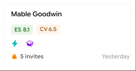
I packed everything a recruiter needs onto each candidate’s card. All segmented scores with a hover that explains each one. Quick tags for stuff like “can start soon” or “might’ve cheated.” A glance shows how many times they’ve been invited. And you can grab a whole batch at once to email or move them. Every card became something you can decide from.


Cards as decision-making units
design 1/4
Making performance legible
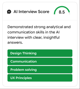
Detailed performance feedback helps with transparency and establishing trust. I highlighted all scores - Resume, Assessment, and AI Interview. Hover over any to read its detailed justification.

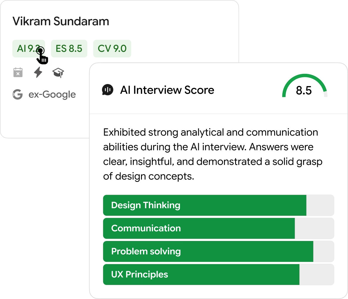
Hover any score to see exactly why it was given
design 2/4
An easy-to-skim signal bar
Recruiters quickly assess candidates using a few key heuristics. I created a compact signal bar that highlights these traits: short tenure, potential unfair practices, competitor experience, availability, and domain expertise. By displaying these as skimmable tags on the card, recruiters can instantly gauge fit and risk without diving into the full profile.
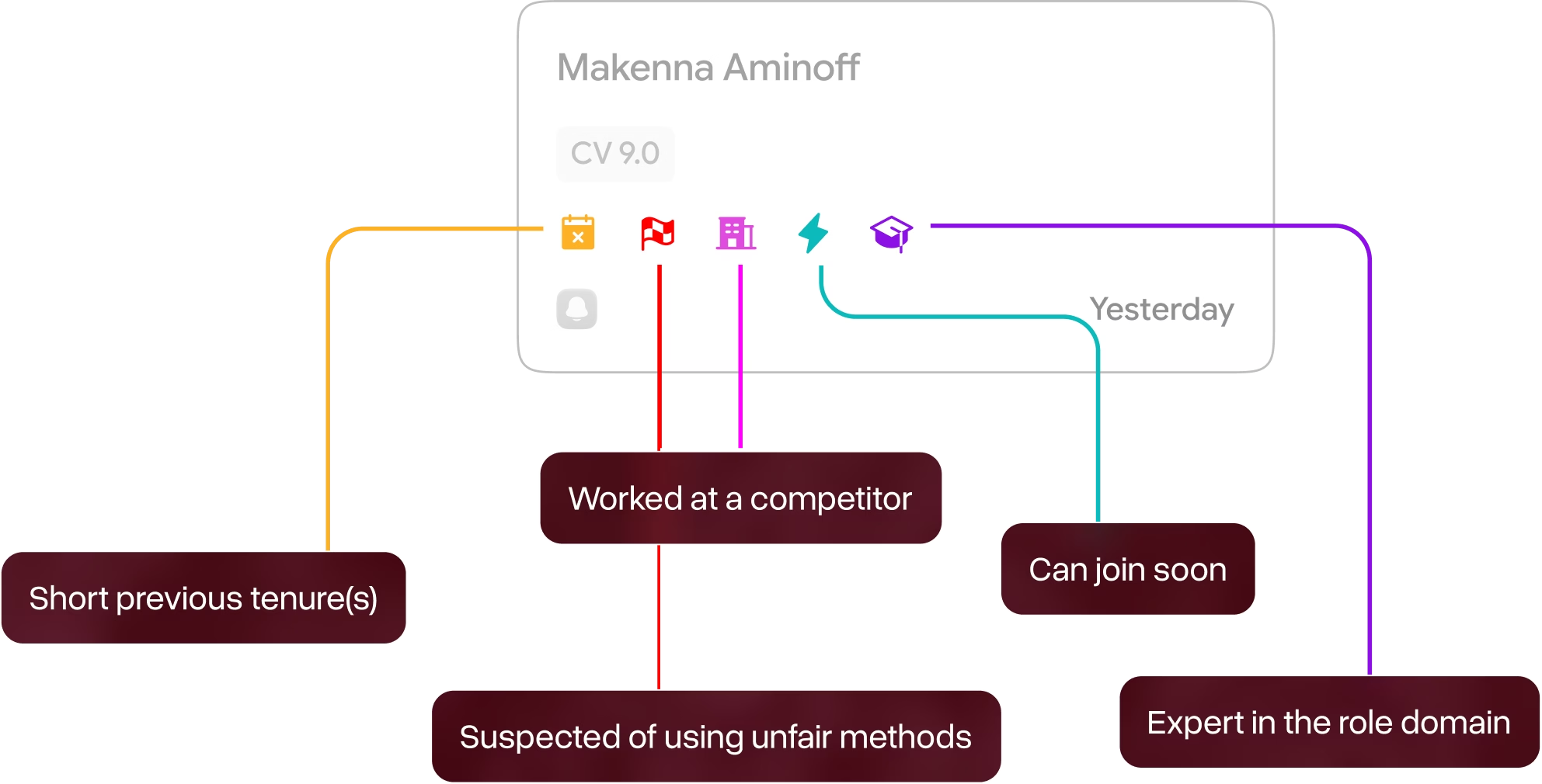
design 3/4
Invite history as a signal
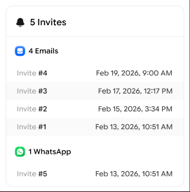
Recruiters care about how often they reach out to a candidate. I surfaced number of invites, place (WhatsApp / Email) of invite, and their timestamps. This information is used by them to gauge interest.

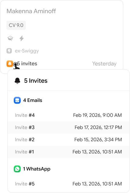
Hover invites to see their history
design 4/4
Bulk actions that feel obvious
Recruiters care about how often they reach out to a candidate. I surfaced number of invites, place (WhatsApp / Email) of invite, and their timestamps. This information is used by them to gauge interest.


Bulk selection bar
Behind the scenes


Killed: one unified score (0 to 10)
The pitch was fewer numbers, faster calls. Recruiters hated it. One score hid the exact detail they use to decide. A 7 says nothing about whether someone can code or just interviews well.

Killed: emoji signals
I tried pure emoji to keep cards light. They failed on recall, and a flame or red flag reads as unserious for a decision this expensive. Lesson: a signal scanned hundreds of times a day has to be instantly readable and carry the weight of the call.
Killed: rejected and on-hold as their own columns
I gave them dedicated columns to clear the active flow. It broke fast. A column should mean a stage, not a status, and once someone sat in “Rejected” you lost which stage they came from.
Shipping
The redesigned board shipped to an early cohort of scale-hiring customers. Recruiters opened fewer profiles, bulk-moved candidates with confidence, and stopped complaining about too many tabs. The numbers are directional, but they point to materially faster triage — a projected ~40% drop in time-to-hire, based on comparable Goodfit rollouts.

up to 40%
Faster hiring
early signals point toward materially faster hiring
~30%
Lesser Profile Opens
leading to lower context switching, thus reducing load
2-3x
Conversion on WhatsApp Invites
compared to email, after triaging using invite history